Linux: Improving the Synaptic Package Manager UI
Published on 2018-09-08.
After Synaptic, a popular package manager on .deb-based operating systems, upgraded its GUI library from GTK2 to GTK3, a few small annoyances appeared in its user interface.
Issues

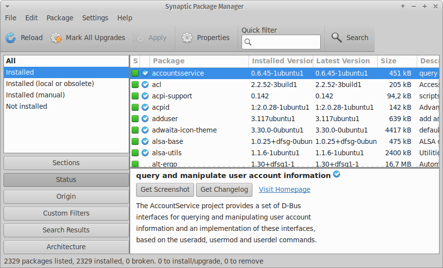
- The toolbar background seems to be cut off in the middle of the window.
- Panes are missing margins, leading to widgets being rendered too close to each other.
- There exist four different ways to show package properties:
- Press the Properties button.
- Hit
Alt+Return. - Enable the “Show package properties in main window” in Settings › Preferences setting.
- Press the Settings › Properties menu item.
Changes

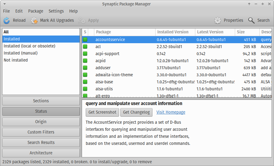
- Fixed the missing margin between the left pane and the right pane.
- Fixed the missing margin between the package list pane and the detail pane.
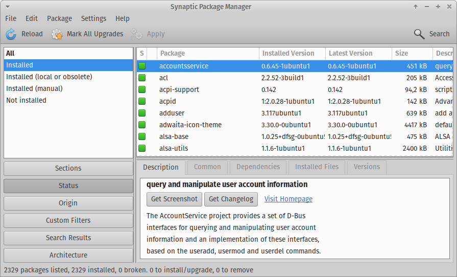
- Moved buttons which operate on the package listing (“Properties”, “Search”) to the right.
- Kept buttons which are more general operations (“Update”, “Mark All Upgrades”, “Apply”) on the left.

- If the the “Show package properties in main window” in Settings › Preferences setting is enabled, the menubar’s “Properties” button is hidden, reducing the amount of different ways package properties are be displayed.